How It Was Shot: Runner's Bum

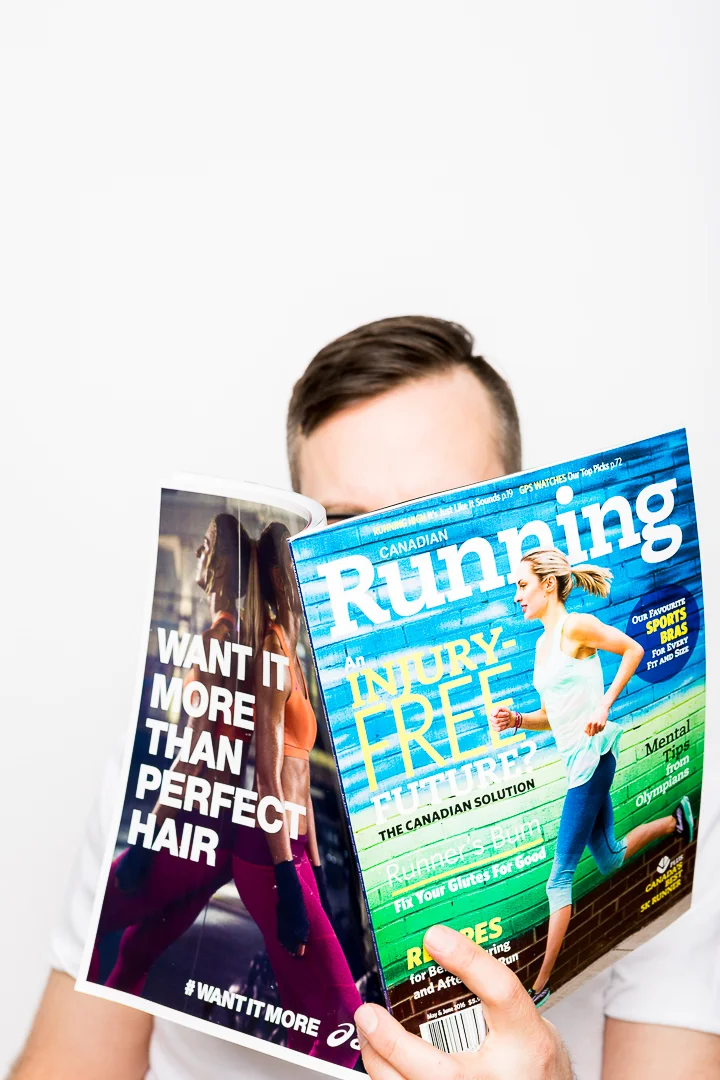
In keeping with my How It Was Shot series, this latest edition looks back at a studio project for Canadian Running Magazine through Gripped Publishing that is on newsstands now. This project was shot earlier this year during a morning session at Zero Three Studios in the east end of Toronto. These behind the scenes retrospectives are to help share my experiences because these types of articles have helped me grow, and I hope to hear from other photographers on new ideas.
The project began with a scope of requirements that called for 10 shots in 2 wardrobe and 2 scene variations to support an upcoming fitness article. That made for a total of about 40 final images, but of course some selections for each.
With portraits, a photography usually draws the viewers focus onto the subject by having them as the brightest thing in the frame. However the model chosen for this project, Tamera R Bent, has a dark complexion. In this scenario I prefer to go with an opposing strategy and rely on contrast to focus the viewers attention in the right spot. Since these photos were going to be included as a series of smaller images in the magazine, I decided to go with a very neutral and balanced lighting design that would maximize detail. However, I did want to create a few shadows through the face and body for depth but not enough to create a dramatic effect.
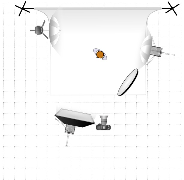
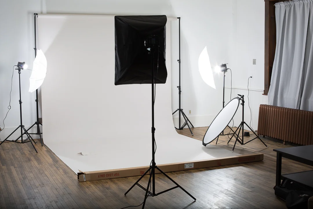
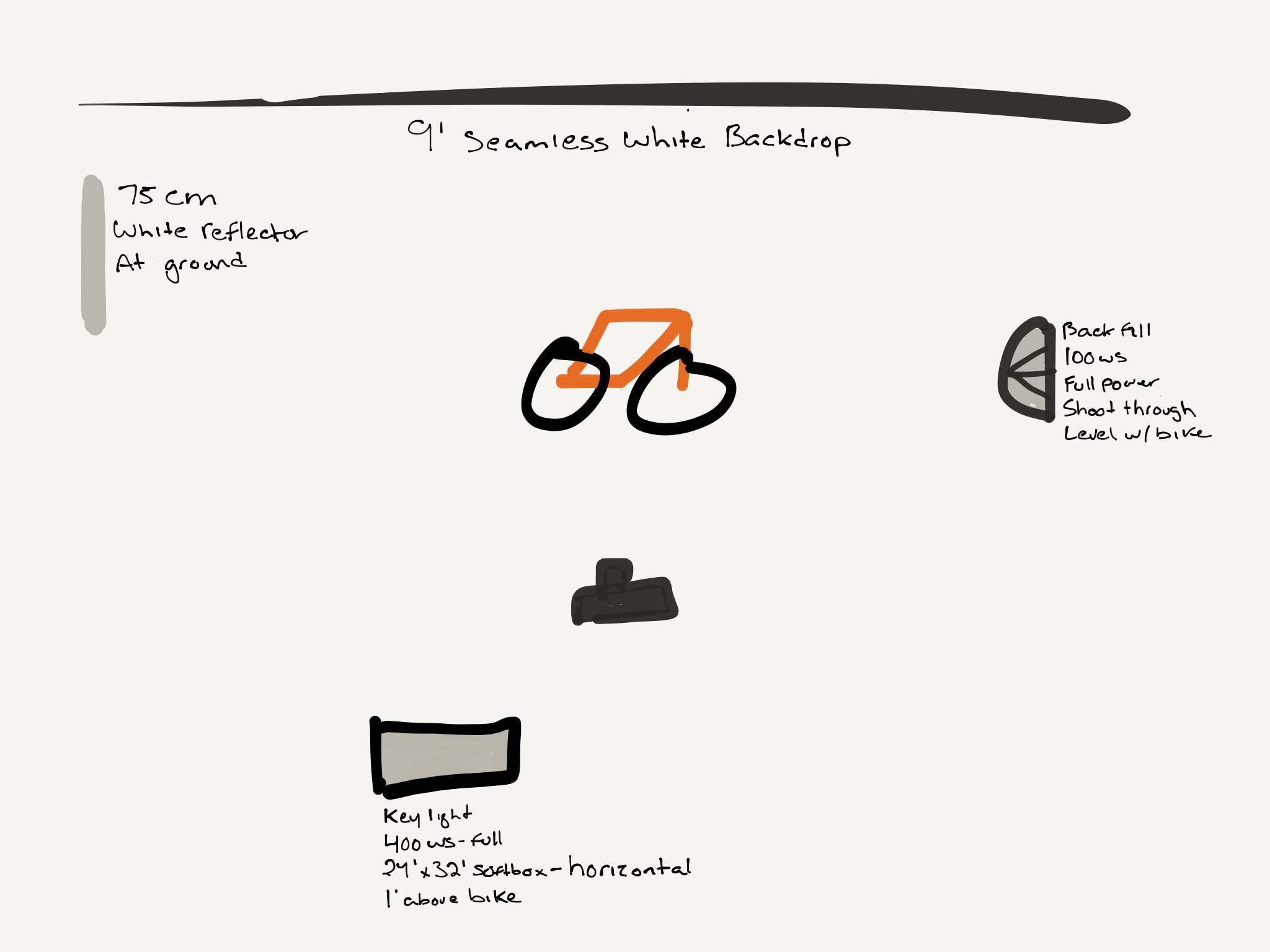
My second shooter, Tom, who is also the Studio Manager at Zero Three collaborated with me on a 3 light, 1 reflector set up included in the diagram here. Now here's how we did it.
In detail , the lighting setup had;
- Back Camera Left: 640ws strobe and a medium softbox that was 6' from the subject and 1' over head.
- Camera Right: 640ws strobe with a shoot through umbrella and powered down to 400ws. Set 3' from the model and level with the upper torso. This was to help fill in light drop off from the main light.
- Camera Left: 100ws strobe with a shoot through umbrella as a background fill and hair light. This is set shoulder pointing to fill in shadows on the floor.
- Finally, in front and low right of the model is a white reflector for filling in low and face shadows.
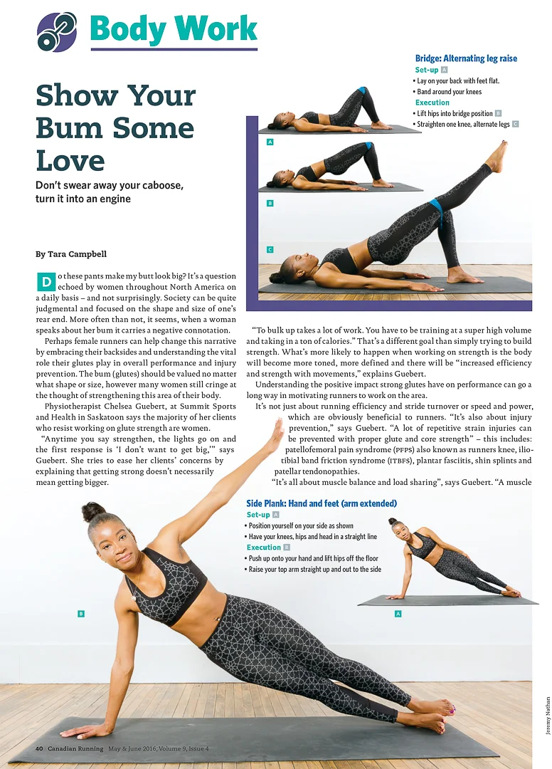
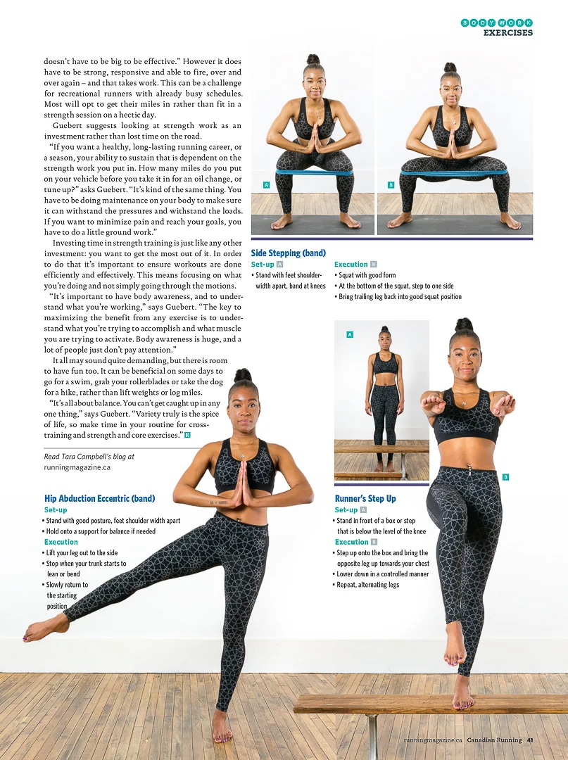
In the end the client we wrapped the shoot in the one session and post production and editing took the remainder of the afternoon. The project was delivered on time and the client is happy. Below is a view of the article as it appears in the May/June issue of Canadian Running Magazine. Go grab a copy and see the article in hand.
I hope this How It Was Shot helps and if you've got any questions, suggestions, or feedback use the comments section below.
