How It Was Shot: UniQlo Bike Giveaway

As a follow up to my freelance work supporting the Uniqlo Canada pop-up shop at Blacksmith Cycle, I was called to photograph another collaboration between these two brands. Over the next few weeks they are going to be giving away a complete build VYNL road bike with a private consultation and they wanted promo shots for the contest. One lucky winner is going to walk away with a club ride killer.
The promo build is an VYNL aluminum road frame with slightly relaxed geometry, an Ultegra 6800 11-speed mechanical groupset fitted out with a Shimano PRO series cockpit. The finals wheels (not shown) are a set of Mavic Aksium Elites. For more info on the giveaway and how to enter, click here. And for more info on the collaboration, click here.
I'm really stoked that they asked me to be a part of the collaboration again but I figured rather than just posting about the giveaway, I would do another behind the scenes on how the photoset was shot. Behind the scenes blogs have been really helpful to me as a photographer in learning new skills to try. So by sharing them myself I hope that I can help pay it forward a bit. If you'd like to see more of these types of posts, use the comments below and let me know.
Since opening their flagship Toronto location, I've been in the Uniqlo store a few times checking it out and picking up some new gear. While browsing the store I like to nerd out and took a closer look at their current marketing campaign photography. Studying the compositions, the posings, and especially the lighting.
What I see in the current campaign is simple center compositions with slightly angled poses set against infinite backdrops. The camera angles are generally levelled. But what strikes me most is the very even lighting. The models and clothing are obviously well light, but the lighting design is balanced with minimal shadows. This style tends to be used more in product photography, but I really like this lighting design because it focuses on clarity and resolution more than emotion, mood, or shadow.
When I got the word I'd be shooting the giveaway bike, I wanted to bring it into the studio in order to provide a look that would work with their current brand aesthetic. Rather than shooting on a mid tone background to match the current Uniqlo branding, I went with a slightly off white backdrop to give more contrast and attention to the dark components of the bike. It also allows them to more easily cut the bike out of the image in post production if need be. It's important to me that my clients have lots of options.
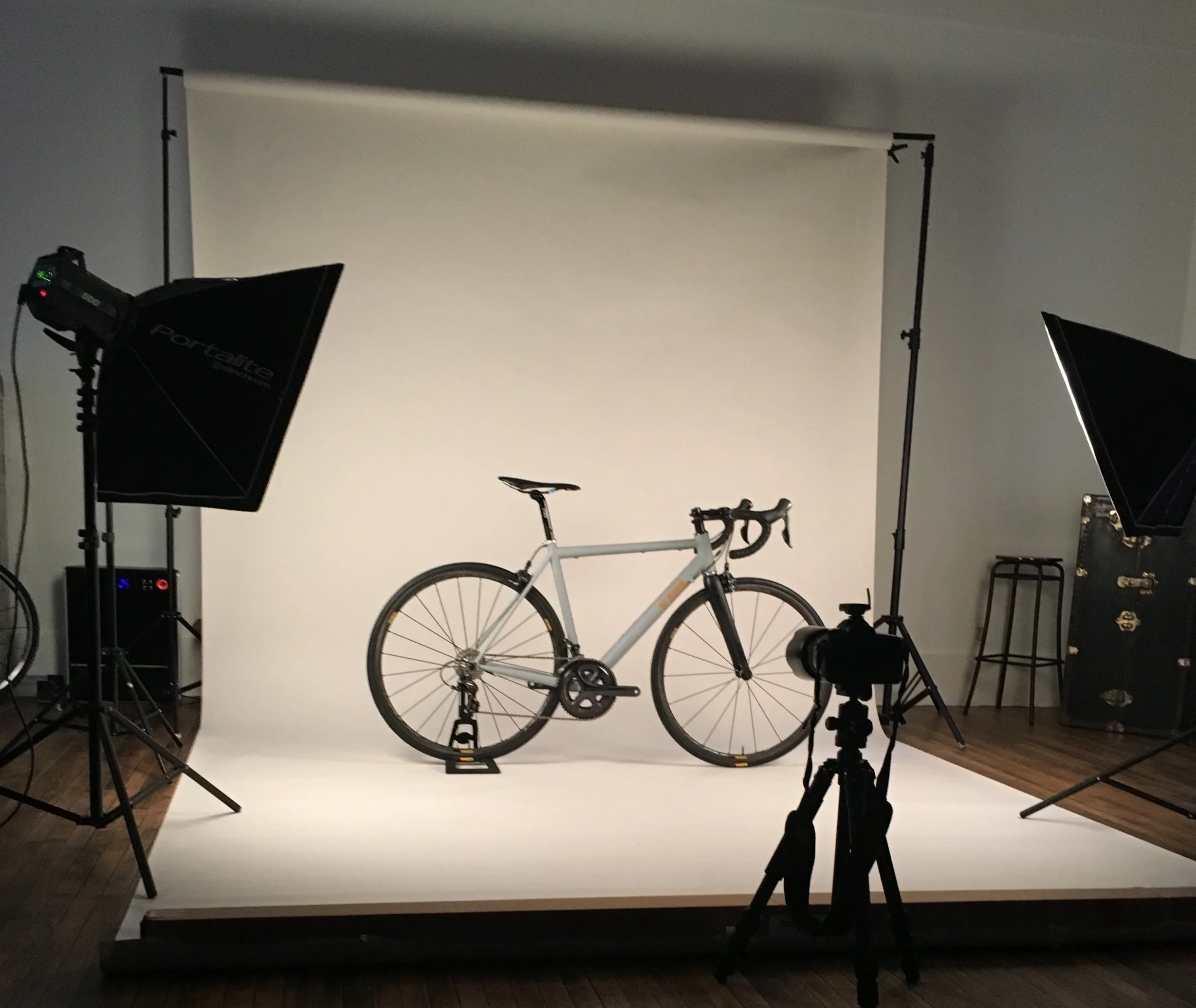
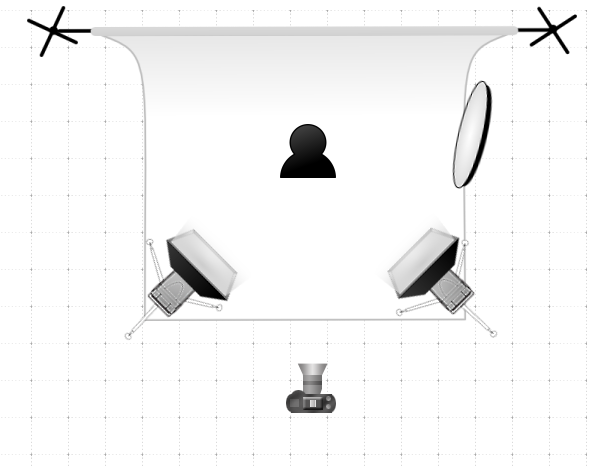
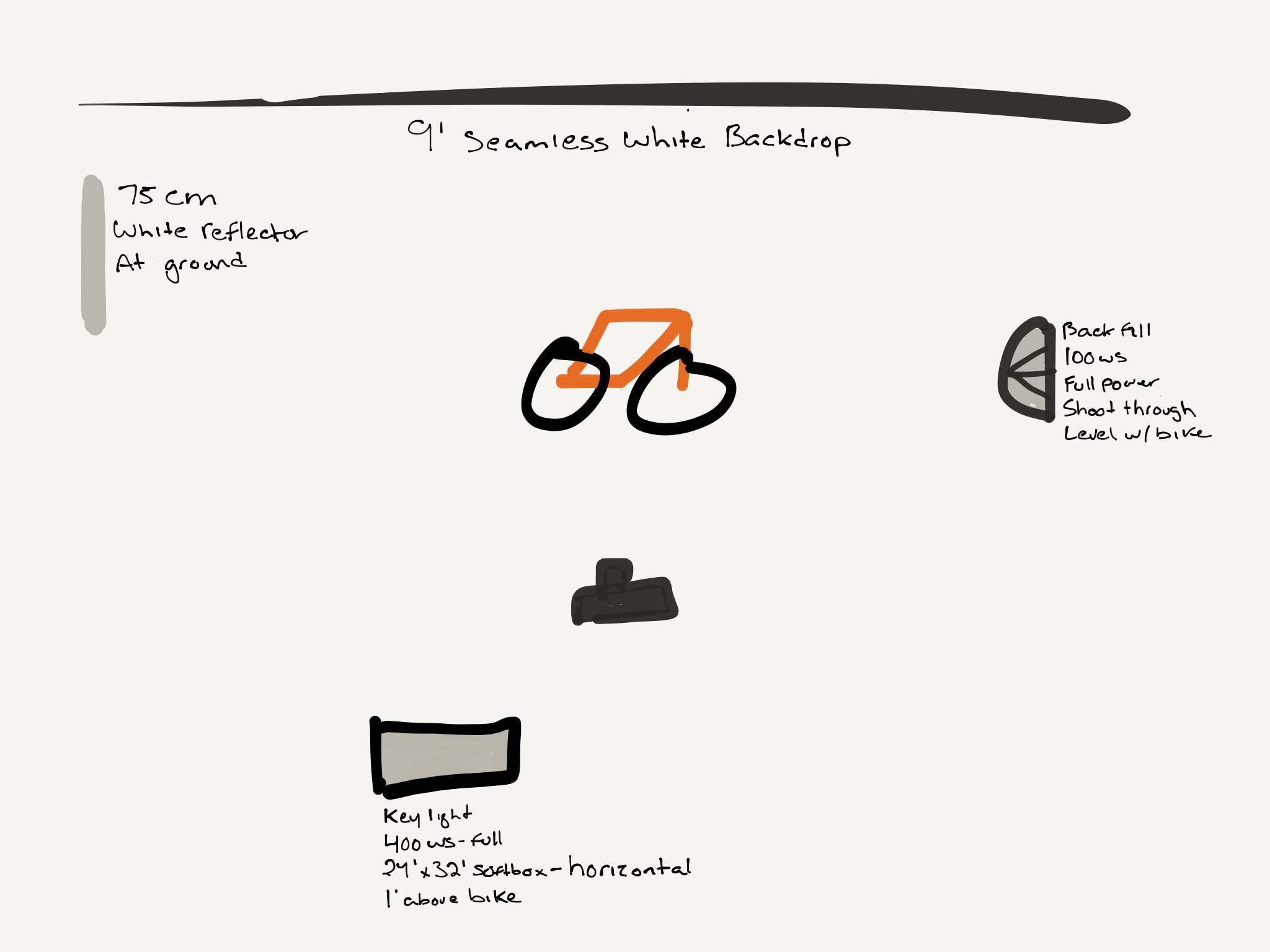
For our lighting design I put together a simple two light setup with a bounce fill. I used two Elinchrom BRX 500 studio strobes (these are my favourites for their reliability and colour) set evenly at about 2/3rd power, positioned slightly above, and pointing down. These were placed at ~45* to either side of the bike. This position with medium soft boxes gives an even light all the way across the bike. The slightly above and downward angle places small catchlights and highlights over the top edges with slight shadows on the floor so the bike looks planted rather than floating.
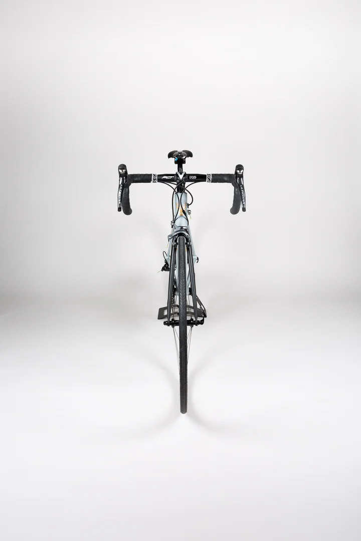
The setup is evidenced by taking a look at the chainring on the crank. You'll notice two nearly identical catch lights on the top left and right edges of the side view image. In the head on shot, take a look at the symmetrical and even shadows on the floor on either side of the front wheel. These are clues to the location and types of lighting used.
A final note is the bounce fill which is set camera right, behind the bike, and off camera. It is nearly perpendicular to the bike and pointed towards the backdrop to bounce the camera left strobe . This in order to minimize shadows on the backdrop. Take a look a the lighting diagram included here for a visual of the setup used. While the whole lighting setup is very similar to the one I used in the BTS for the Canadian Running article, for that I used different power ratios to give contrasting shadows, and larger strobes and soft boxes to light a much larger natural setting.
Along with even balanced lighting, a big part of the scope for this project was to get crisp sharpness. To get the right subject isolation and the required resolution, I shot on a Canon 5D MKIII with a 24-70L using the following camera settings: 30 to 42mm, F11, ISO 100, 1/180sec. Copies of the final images are below for reference.
This was a really fun project and I really appreciate the opportunity be a part of it. Big thanks to Tom from Studio Zero 3 here in Toronto for the space and the assist.


