How It Was Shot: Pinarello F10 Cover

In early February I got a request from the photo editor at Canadian Cycling Magazine to shoot the cover for their annual buyers guide issue. It would hit news stands in March. Like most projects I'm working on, we had a pretty tight turn around to make this shoot work. So we had to be sure to nail it. After a quick back and forth on email and a planning call, we put together a project plan and I booked time with Tom at Zero Three Studios here in Toronto.
The cover of this years annual buyers guide would be featuring the new Pinarello F10, the latest Italian super bike to hit the pro peloton. For the cover they needed a new and original image of the bike. The problem was that F10 is and was so new that the hardest part would be getting my hands on one. Luckily, the folks at, The 11, here in Toronto happen to have one in stock. And they were willing to lend it out. It's not everyday someone let's you take a $15k bike out on loan!
In continuing with the spirit of sharing what happens behind the scenes, here is some of what I put into the particular project plan. Since the photo would be used for the cover, it needed to be shot in a vertical portrait orientation. We knew the frameset would be predominantly black and so we debated whether to shoot the bike against a dark black background or a white background. The dark background would allow me to light the bike in a way that it would appear to be camouflaged within the scene. On the flip side, a white background presents a greater sense of contrast and presents the subject as a more singular presence. As you can see, we decided to go with the white background.
As part of the planning process, one thing I always like to do is to provide sample or reference images to the client. This helps them visualize what I'm prepping and ensure we are on the same page. And most importantly creates confidence that I'll deliver against expectations. The photo editor reviewed my sample images and chose a 3/4 angle pose for the Pinarello F10. I like this pose because its not the typical full drive side shot but still gives line up sight to the whole bike. The 3/4 angle also makes the front of the bike larger and gives it a more dramatic stance and the angles of the top and bottom line which would converge out of frame give an sense of direction for the eye to follow. Another trick is to shoot the bike from slightly below level with the camera pointed upwards. This accentuates the size of the bike and creates a sense of power to the stance. I call this the hero pose and it was popular in baseball cards in the late 80s and 90s. It's still used a lot today in business and political portraits.
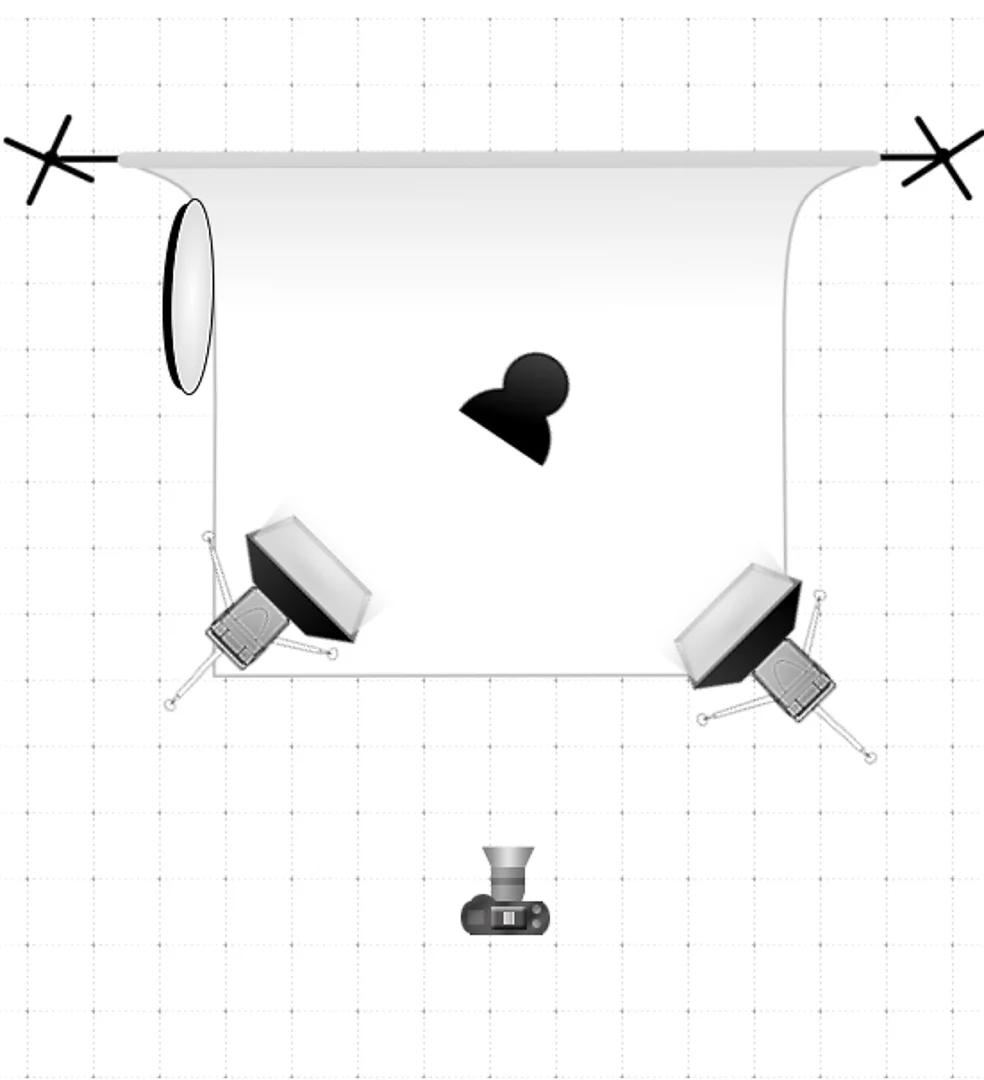
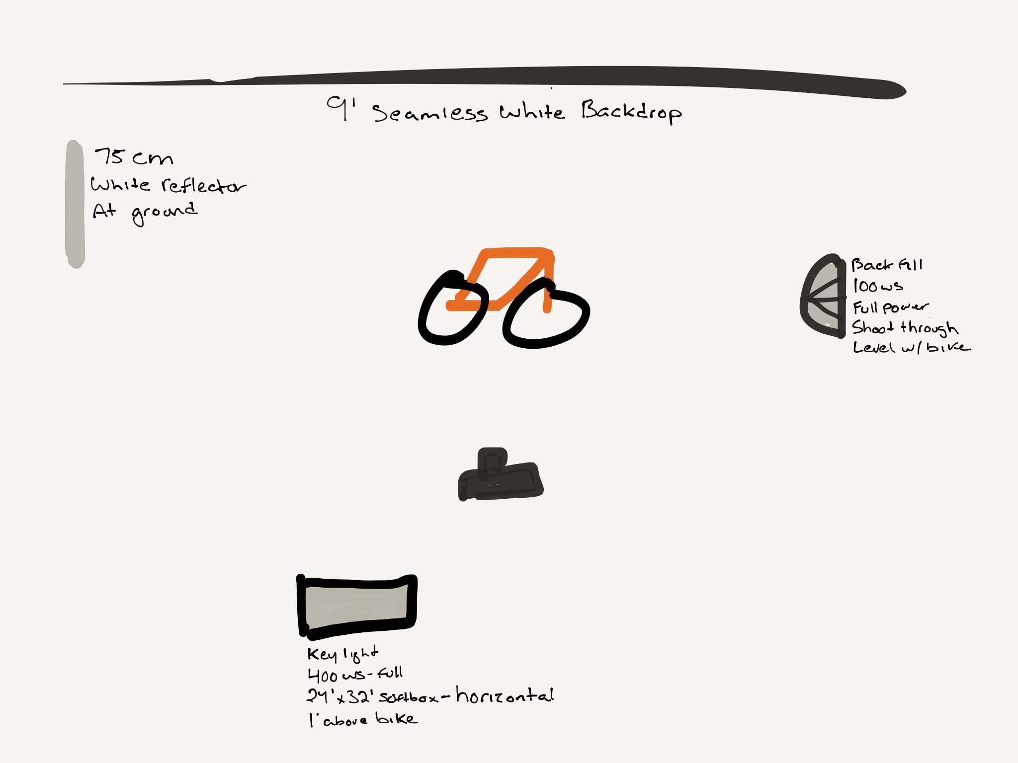
For the lighting I chose to go with a tried and true two light setup with a bounce reflector for shadows. I positioned the primary key light directly perpendicular to the bike and the fill directly parallel in front of the bike. Each light was approximately 5' feet away, about 2' above and pointed downward. The position of the lights keeps the highlights to along the top and leading edges of the bike. The fill light helps to minimize shadows behind the bike and on the backdrop. To further eliminate shadows, especially behind the rear wheel which is closest to the backdrop, I used a white reflector bouncing from the fill. It doesn't push back a lot of light, just enough. It was sitting just off camera left.
It took us about 3 shots to get the lighting balanced, then we sent test shots to the magazine by email. They were happy with the results so we made a few more minor tweaks and snapped the winner. One thing I've really had to relearn is "Don't over shoot it." Anyone who has or still shoots film knows this well, when you have the shot... just stop.
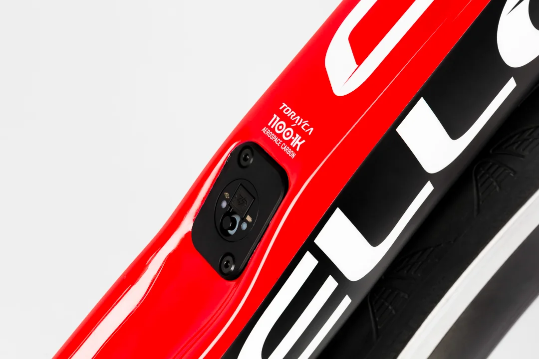
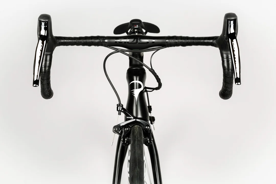
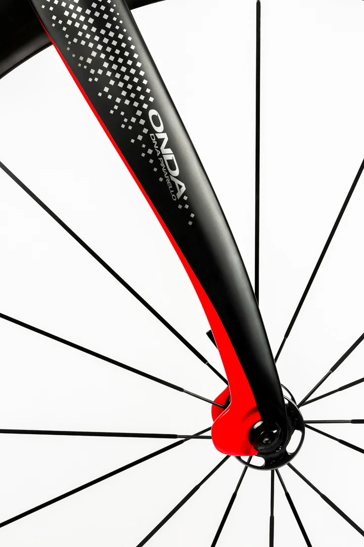
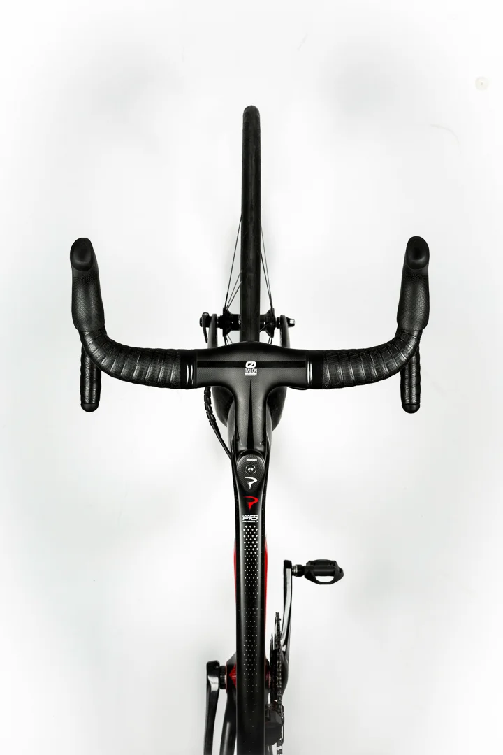
While we were shooting the session it started freezing raining outside. Hardly ideal weather for driving an expensive loaner back to the shop. So we decided to order in lunch and shoot some additional shots for a web gallery. Honestly, when someone lends you a Pinarello F10, you shoot the heck out of it. And we had time to kill. This also gave me a chance to spend some time with Tom working out a few new angles I'd been thinking about. One of them is an overhead birds eye view. It's a different perspective and another way to appreciate all the unique shapes that frame builders are putting together. Hope you enjoy the small gallery below.
If you haven't gotten your hands on a copy, go get one from new stands now. And if you've ever dreamed of owning a Pinarello Dogma, or a bike that's been on the cover of a magazine, this is your chance. Last I checked while at the recent Toronto International Spring Bike Show, this was still available at The 11.
Thanks Matt, Heath, and Brian for helping put this together.

